Colors are one of the strongest tools in social media ads. They affect how people feel, how they react, and even whether they click or ignore an ad. In 2026, color psychology matters more than ever because users scroll faster, and brands need colors that catch attention instantly without feeling overwhelming.
This updated guide explains the latest color trends, how colors influence conversions, best colors for each industry, common mistakes, and simple palette ideas you can use for your ads.
Updated 2026 Color Trends
Design in 2026 has shifted toward cleaner, softer, and emotionally balanced colors. Bright neon colors are now used carefully, while calming and premium tones have become more popular.
Here are the trending directions:
- Soft Pastel Shades: Calm, friendly, and easy on the eyes.
- Warm Neutrals: Beige, sand, warm grey — used to show calmness and trust.
- Modern Blues & Purples: Tech, finance, and digital brands use them for a futuristic look.
- Eco-Greens: Fresh, natural tones related to growth, health, and wellness.
- Minimal Black & White: Used for premium and luxury content.
- Muted Brights: Colors that are bright but softened — perfect for social media visibility.
These colors feel modern, emotional, and comfortable for viewers who spend long hours online.
Why Certain Colors Boost Conversions
Colors influence emotions. Emotions influence actions.
A viewer decides in less than a second whether they want to engage with your ad — and color plays a major role in that decision.
Here’s how colors can increase conversions:
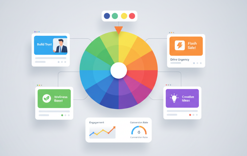
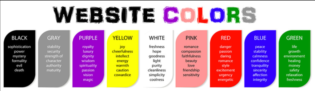
- Blue builds trust, so people feel safe clicking.
- Red creates urgency, perfect for limited-time offers.
- Green feels positive, great for health, finance, and wellness.
- Yellow attracts attention, helpful for hooks or callouts.
- Black feels premium, ideal for luxury items or clean layouts.
- Purple suggests creativity, used in digital, education, and coaching ads.
When ads use colors that match the message, the click-through rate goes up naturally.
Industry-Wise Color Suggestions
Each industry triggers different emotions. Here are simple, effective color directions:
Health & Wellness
Use:
- Calm greens
- Soft blues
- Warm neutrals
These colors communicate safety, balance, and care.
Finance & Business
Use:
- Deep blue
- Navy
- Teal
- Dark green
These shades show trust, stability, and responsibility.
Education & Coaching
Use:
- Purple
- Blue
- Soft yellow
These colors feel smart, creative, and motivating.
Fashion & Lifestyle
Use:
- Black & white
- Soft pinks
- Modern beige
- Muted bright tones
These colors feel bold, stylish, and modern.
Common Color Mistakes People Make
Most colors fail not because of the shade but because of how they are used. Here are the mistakes to avoid:
- Using too many colors in one design
- Choosing bright colors that hurt the eyes
- Using low contrast between text and background
- Mixing colors that don’t match the brand message
- Using neon colors everywhere instead of selectively
- Forgetting that mobile screens need good readability
When colors fight for attention, the message disappears.
Conclusion
Color psychology is one of the simplest ways to improve ad performance in 2026. The right color attracts attention instantly, builds emotion, and guides users toward action. The wrong color creates confusion and pushes people away.
Use colors:
- that fit your brand
- that match your industry
- that feel easy on the eyes
- that create emotional clarity
With the right palette, your social media ads will look modern, clean, and conversion-friendly.